Available for New Projects
Trusted by founders.
Creative
Creative

Design
for

Businesses & Startups
based in
India

(& beyond)
I make it easy for founders to launch, grow, and scale with sharp brand identities and clean digital experiences, no delays, no drama.

Logo & Branding
Social Media Design
Logo & Branding
UI/UX Design
Social Media Design
Logo & Branding
IIT Madras Alumnus
6 Years of Experience
50+ Brands Designed
IIT Madras Alumnus
6 Years of Experience
Logo & Branding
Social Media Design
Logo & Branding
UI/UX Design
Social Media Design
Logo & Branding
IIT Madras Alumnus
6 Years of Experience
50+ Brands Designed
IIT Madras Alumnus
6 Years of Experience
(
)
I help fast moving digital startups launch sharper brands with clarity, speed and well designed brand systems.
I help fast moving digital startups launch sharper brands with clarity, speed and well designed brand systems.
Branding
Logo
Website
Logo
Interface
Strategy
(Why clients love ahfos)
Testimonials

1+
1+
Finalized Projects
18%
18%
Client satisfaction rate
1
1
Years of Work

01
/ 03
"Franklin turned our ideas into a sharp, clean brand. Fast, easy, and right on point."
Ethan Moore
Co-founder,NovaTech

02
/ 03
"Clear, thoughtful, and fast — Franklin made the whole process effortless."
Olivia Tran
Creative Director, Bloom Agency

03
/ 03
"Smart design, smooth delivery. Franklin is great to work with."
Lucas Bennett
Product Manager, Hexa Studio
01
/ 03
"Franklin turned our ideas into a sharp, clean brand. Fast, easy, and right on point."
Ethan Moore
Co-founder,NovaTech
02
/ 03
"Clear, thoughtful, and fast — Franklin made the whole process effortless."
Olivia Tran
Creative Director, Bloom Agency
03
/ 03
"Smart design, smooth delivery. Franklin is great to work with."
Lucas Bennett
Product Manager, Hexa Studio
(Why clients love Agero)
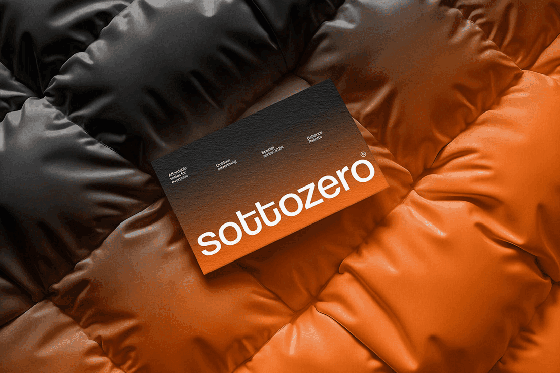
Recent Works

The Samdosh logo is a visual manifestation of balance - the very essence of Ayurveda and the meaning behind the word Samdosh itself. Formed through two opposing yet harmonious hands, it represents the equilibrium between masculine and feminine energies, the healer and the healed, the body and the mind. Between them, a levitating circle symbolizes centeredness and flow - the perfect state of alignment among the three doshas. This circle, while simple, carries layered meaning: it can be seen as a tablet, a planet, or the eternal cycle of life - each reflecting the idea of balance and restoration. In the negative space between the two hands, the letter ‘S’ subtly emerges - a quiet nod to Samdosh, crafted not by addition but by absence. It reinforces the idea that true harmony is not created, but revealed, when all elements come into balance. The logo’s minimal geometry and clean form reflect the brand’s modern-luxury approach to Ayurveda - grounded in ancient wisdom, refined through contemporary design. It stands as both a symbol of healing and a mark of equilibrium - a visual representation of what it means to find the balance within.
samdosh
samdosh
Samdosh Ayurveda
samdosh
2025
samdosh
Designer
samdosh
samdosh
samdosh
samdosh
samdosh

The Tasty’s logo is built around the Chandrakor, a symbol deeply rooted in Marathi culture. Traditionally worn as a mark of identity, pride, and heritage, the Chandrakor connects the brand directly to its origins in Maharashtra. By using this cultural icon as the core of the logo, Tasty’s grounds itself in authenticity and local flavor from the very first glance. The symbol is rendered in a hand-drawn, imperfect brush style, giving it a warm, homely character. This intentional roughness mirrors the textures of real kitchens—smudges, strokes, splashes—and reflects food that is genuine, comforting, and made with heart. The organic shape evokes the feeling of something prepared by hand, not manufactured, reinforcing the brand’s commitment to honest, home-style taste. Together, the cultural significance of the Chandrakor and the handcrafted aesthetic create a logo that feels familiar, flavorful, and rooted in tradition, perfectly capturing the soul of Tasty’s. Authentic like home, proud like its culture, and full of character.
tastys
tastys
Tasty's
tastys
2025
tastys
Designer
tastys
tastys
tastys
tastys
tastys

352 Foreground Media was built on the idea that clarity never goes out of style. The goal was to create a brand that speaks in simplicity but leaves an impact that’s hard to forget. Every line, color, and space was designed to feel intentional, sharp, and precise. The name itself tells a story. 352 comes from the ASCII sum of the word MEDIA, tying the brand back to its digital roots. Foreground represents the space that demands focus, the part of any frame that holds attention. Together, they stand for what we believe in—putting what matters most front and center. The logo is built from the negative spaces of 3, 5, and 2, subtly forming the initials F and M. Nothing here is accidental. Every edge, every gap, has purpose. The geometry is minimal yet flexible, designed to work on anything from a billboard to a favicon while still carrying the same bold clarity. We chose Helvetica Neue because it feels timeless, honest, and balanced. It doesn’t scream; it communicates. For us, that’s the point. 352 FM doesn’t just create visuals; it builds presence. Work that’s simple, striking, and impossible to ignore.
352fm
352fm
352 Foreground Media
352fm
2025
352fm
BRAND DESIGNER
352fm
352fm
352fm
352fm
352fm
(Services)
What we do
Web Design
Brand Design
Logo Design
We build bold, cohesive brand identities that leave a lasting impression.
Visual Identity
Style Guides
Brand Strategy

Brand Design
Brand Design
Brand Design
(Intro)
Meet Finton
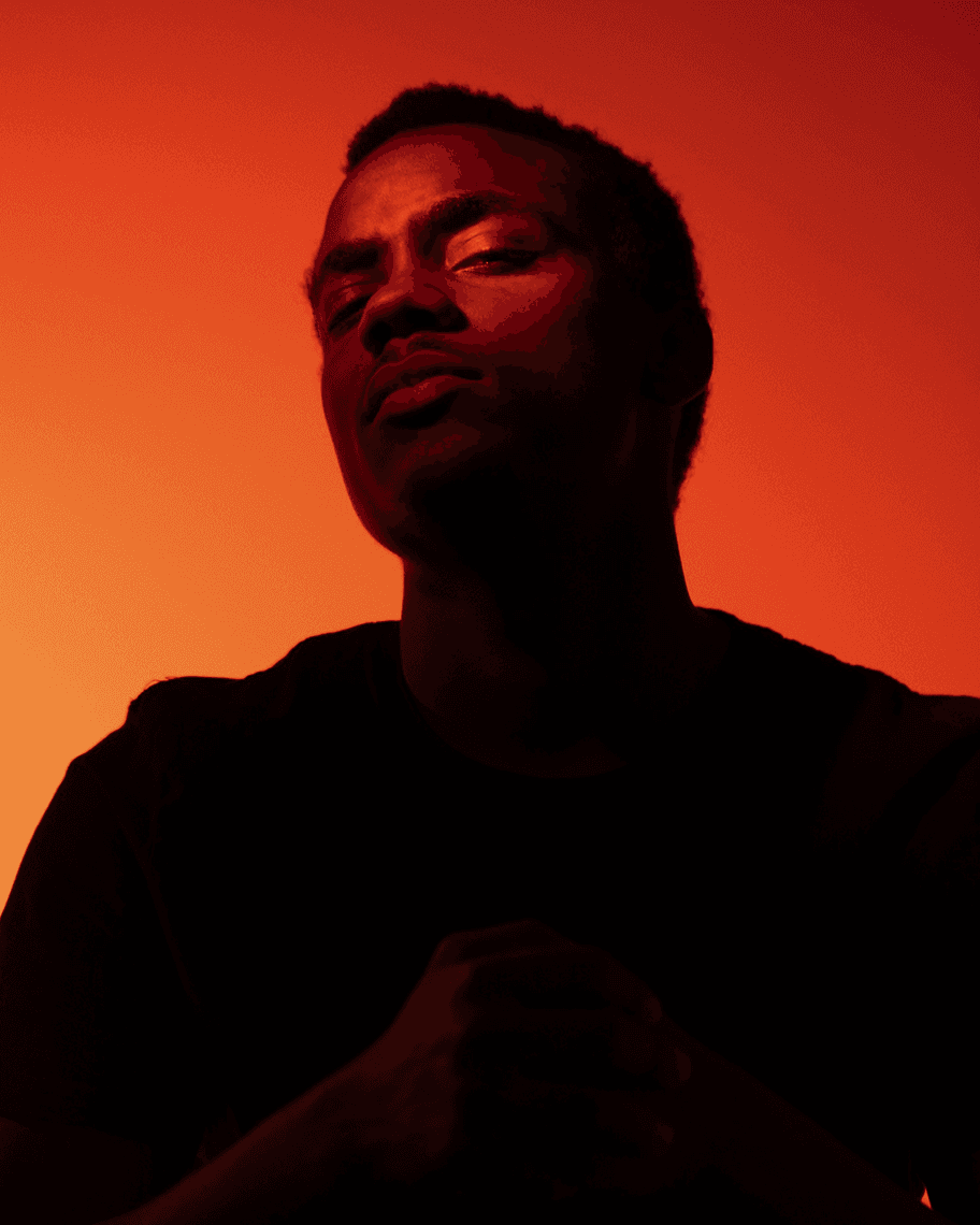
The Founder
Franklin Clinton is a visual designer focused on crafting bold, functional design systems. He works with creative teams and startups to build standout brands and seamless digital experiences. Based in London, he balances clarity with character — and enjoys experimenting with motion design and interactive visuals in his spare time.
Founder at Agero
2024-Now
Brand Designer at Google
2023-2024
Web Designer at Shopify
2018-2023
Junior Designer at Meta
2015-2018
(Intro)
Meet Finton
The Founder
Franklin Clinton is a visual designer focused on crafting bold, functional design systems. He works with creative teams and startups to build standout brands and seamless digital experiences. Based in London, he balances clarity with character — and enjoys experimenting with motion design and interactive visuals in his spare time.
Founder at Agero
2024-Now
Brand Designer at Google
2023-2024
Web Designer at Shopify
2018-2023
Junior Designer at Meta
2015-2018
(Pricing Plan)
Explore Pricing
Standard Plan
Ideal for lean teams or startups needing clean, fast design delivery for websites or branding assets.
Delivery Time
4-6weeks
500$
/month
You provide the wireframe
Visual design using Figma & Framer
Focused on website or branding only
Weekday turnaround (Mon–Fri)

Premium Plan
A complete design experience — tailored strategy, polished visuals, and flexible collaboration throughout the process.
Delivery Time
4-6weeks
Starting at
$1000
Help shaping your wireframe or brief
Custom design for website, brand, or logo
High-fidelity mockups using Figma & Framer
Dedicated weekday focus & deeper involvement
(Pricing Plan)
Explore Pricing
Standard Plan
Ideal for lean teams or startups needing clean, fast design delivery for websites or branding assets.
Delivery Time
4-6weeks
500$
/month
You provide the wireframe
Visual design using Figma & Framer
Focused on website or branding only
Weekday turnaround (Mon–Fri)
Premium Plan
A complete design experience — tailored strategy, polished visuals, and flexible collaboration throughout the process.
Delivery Time
4-6weeks
Starting at
$1000
Help shaping your wireframe or brief
Custom design for website, brand, or logo
High-fidelity mockups using Figma & Framer
Dedicated weekday focus & deeper involvement
(FAQs)
Your Questions, Answered
Helping you understand our process and offerings at Agero.
Why’s Agero instead of full-time designer?
Speed of design delivery?
Pretty quick! Most designs are delivered in 2–3 business days. We prioritize quality without slowing you down.
What’s the Agero progress like?
How to request a design?
What if I don’t like design?
Are there any refund?
Let's Connect

Got a project in mind?
Let's make something happen together
Let's Connect
Got a project in mind?
Let's make something happen together
Let's Connect
Got a project in mind?
Let's make something happen together