Samdosh Ayurveda
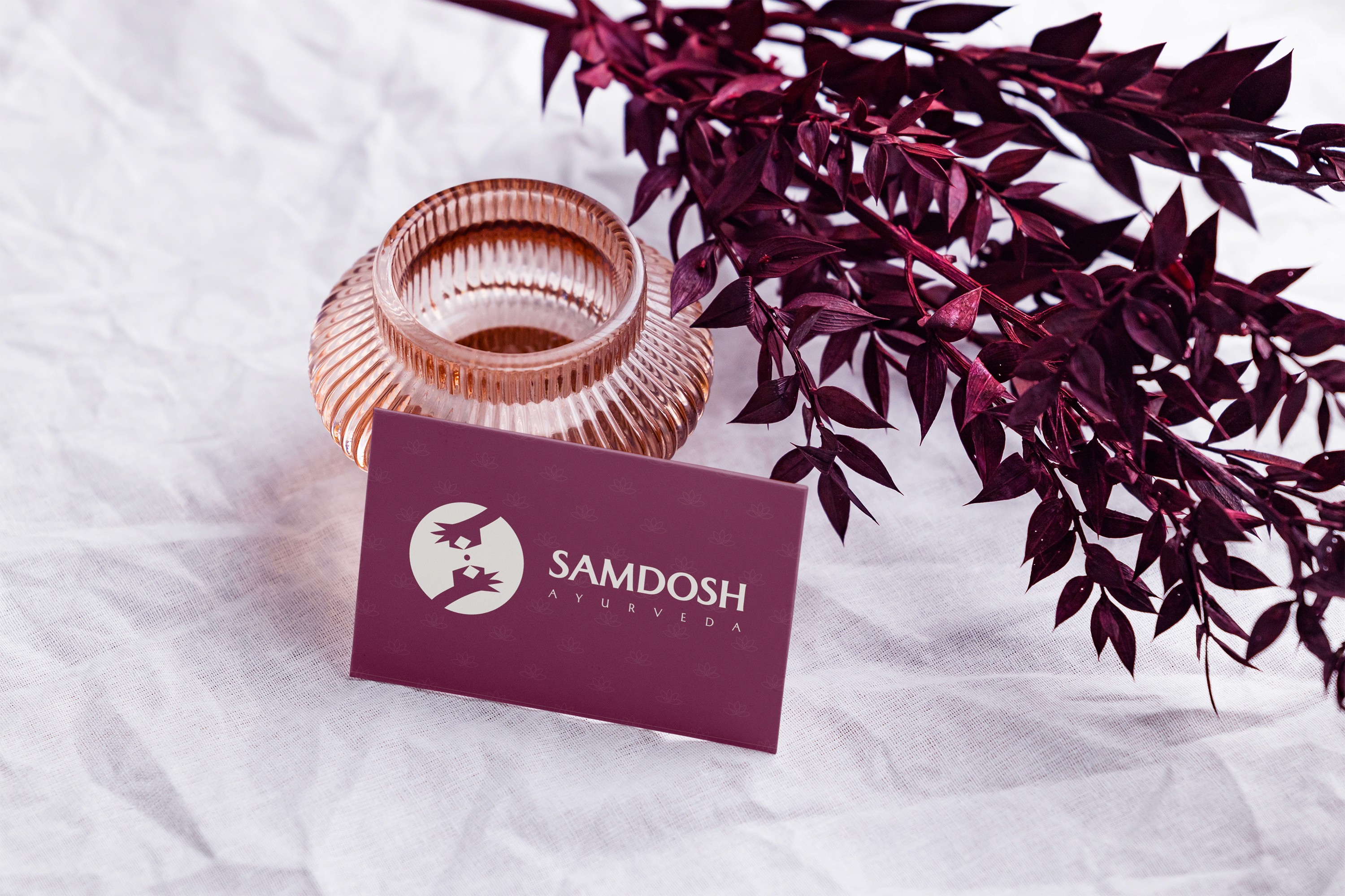
The Samdosh logo is a visual manifestation of balance - the very essence of Ayurveda and the meaning behind the word Samdosh itself. Formed through two opposing yet harmonious hands, it represents the equilibrium between masculine and feminine energies, the healer and the healed, the body and the mind. Between them, a levitating circle symbolizes centeredness and flow - the perfect state of alignment among the three doshas. This circle, while simple, carries layered meaning: it can be seen as a tablet, a planet, or the eternal cycle of life - each reflecting the idea of balance and restoration. In the negative space between the two hands, the letter ‘S’ subtly emerges - a quiet nod to Samdosh, crafted not by addition but by absence. It reinforces the idea that true harmony is not created, but revealed, when all elements come into balance. The logo’s minimal geometry and clean form reflect the brand’s modern-luxury approach to Ayurveda - grounded in ancient wisdom, refined through contemporary design. It stands as both a symbol of healing and a mark of equilibrium - a visual representation of what it means to find the balance within.


Client
Samdosh Ayurveda
DELIVERABLES
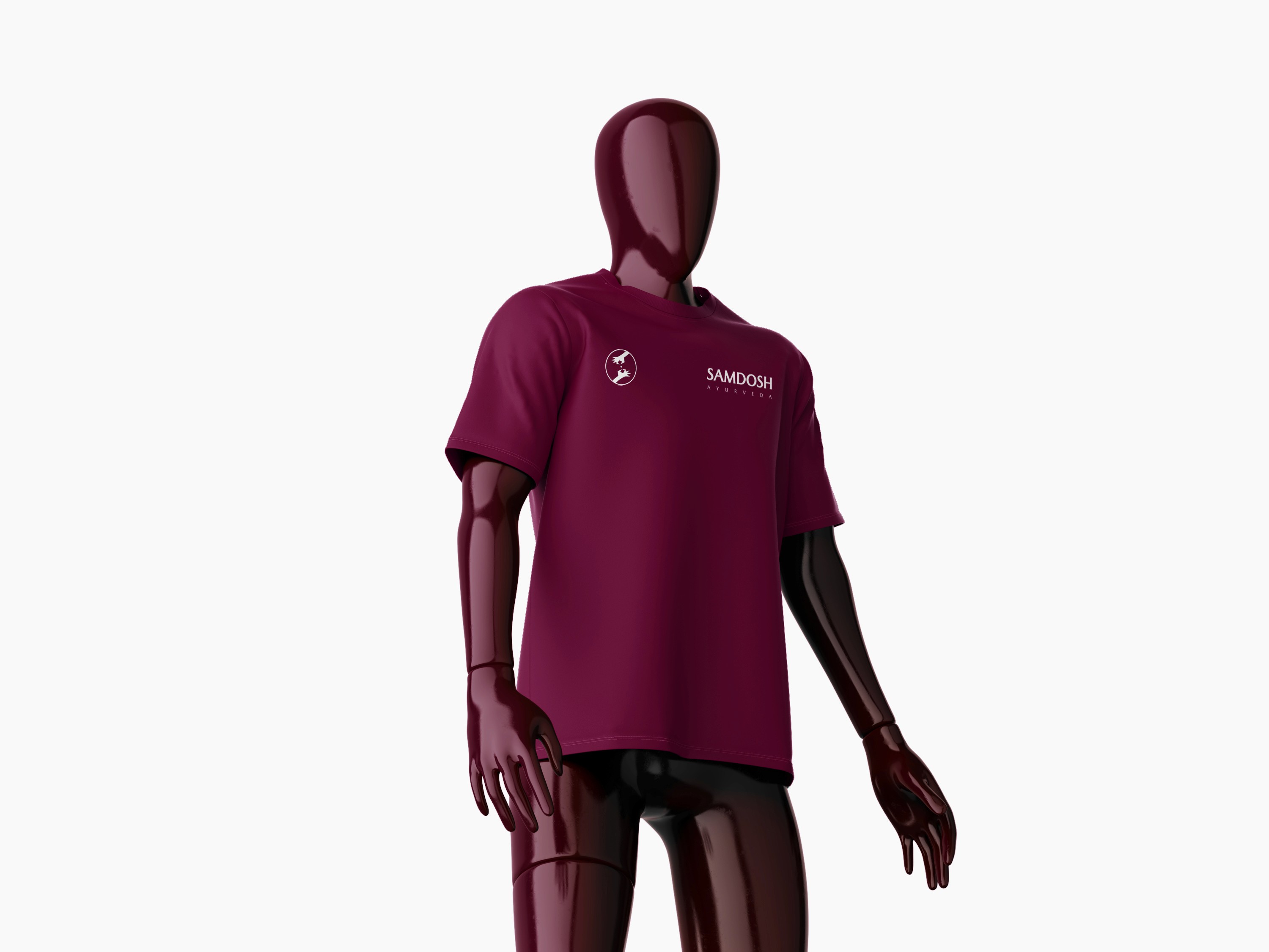
Logo Packaging Letterhead Business Card Social Media
Year
2025
Role
Designer

